import numpy as np
import matplotlib.pyplot as plt
import scipy
import seaborn as sns
import pandas as pd
from sklearn.decomposition import PCA
from sklearn.cluster import KMeans
from numpy.linalg import cond, matrix_rank, norm
from scipy.linalg import inv, solve, det, eig, lu, eigvals
from sklearn.metrics import confusion_matrixECON526: Problem Set 4
Student Name/Number:
Instructions
- Ensure you modify the field above with your name and student number above immediately
- Modify directly and do not rename the file as Canvas will automatically append your name to it.
- Submit both the
.ipynband an exportedhtmlversion of this file. - See here for instructions.
- Do not change the filenames. Canvas automatically appends your name/student number to submitted files.
Setup
Feel free to use the following packages (and we have added a few convenience imports)
Question 1
Take the following code from our PCA examples in class:
N = 50 # number of observations
L, M = 2, 3 # number of latent and observed factors
Z = np.random.randn(N, L) # latent factors
F = np.array([[1.0, 0.05], # X_1 = Z_1 + 0.05 Z_2
              [2.0, 0.0], # X_2 = 2 Z_1
              [3.0, 0.1]]) # X_3 = 3 Z_1 + 0.1 Z_2
X = Z @ F.T + 0.1 * np.random.randn(N, M) # added noise
pca = PCA(n_components=2) # one less, and correctly specified
Z_hat = pca.fit_transform(X) # transformed by dropping last factor
# Scale and sign may not match due to indeterminacy
print(f"Correlation of Z_1 to Z_hat_1 = {np.corrcoef(Z.T, Z_hat.T)[0,2]}")
print(f"Correlation of Z_2 to Z_hat_2 = {np.corrcoef(Z.T, Z_hat.T)[1,3]}")
Correlation of Z_1 to Z_hat_1 = 0.9992026698925253
Correlation of Z_2 to Z_hat_2 = -0.6183747743790763Question 1.1
We said that it was doing a terrible job at separating out the 2nd from the 3rd latent factor. Can you show code to demonstrate this and then provide a description of why you think it is happening?
# Your code hereAnswer:
(double click to add an explanation here)
Question 1.2
Change the \(F\) matrix in our previous code - leave the noise and other parameters intact - to make it so that it is more clearly a data generating process with 2 latent factors as is specified. Hint: get better separation between 2nd and 3rd singular values
# Your code and explanation hereQuestion 1.3
This example contains the same \(F\) as the original.
N = 50 # number of observations
L, M = 2, 3 # number of latent and observed factors
Z = np.random.randn(N, L) # latent factors
F = np.array([[1.0, 0.05], # X_1 = Z_1 + 0.05 Z_2
              [2.0, 0.0], # X_2 = 2 Z_1
              [3.0, 0.1]]) # X_3 = 3 Z_1 + 0.1 Z_2
X_new = Z @ F.T + 1e-16 * np.random.randn(N, M)
print(PCA(n_components=3).fit(X_new).singular_values_)
print(PCA(n_components=3).fit(X_new).explained_variance_ratio_)
[3.05571974e+01 4.22582984e-01 1.89765010e-07]
[9.99808789e-01 1.91211461e-04 3.85586822e-17]Give an explanation for the key differences of these results compared to our baseline
Answer:
(double click to add an explanation here)
Question 2
Question 2.1
The clustering example we gave in class worked quite well. Modify the example to make it perform worse and briefly explain why
# Modify this directly for your example
mu_1 = np.array([0.0, 0.0]) # mean of k=1
mu_2 = np.array([1.0, 1.0]) # mean of k=2
sigma = np.array([[0.2, 0], [0, 0.2]]) # use same variance
N = 100 # observations
X_1 = np.random.multivariate_normal(mu_1, sigma, N)
X_2 = np.random.multivariate_normal(mu_2, sigma, N)
df_1 = pd.DataFrame({"f1": X_1[:, 0], "f2": X_1[:, 1], "k": 1})
df_2 = pd.DataFrame({"f1": X_2[:, 0], "f2": X_2[:, 1], "k": 2})
df = pd.concat([df_1, df_2], ignore_index=True)
kmeans = KMeans(n_clusters=2, random_state=0)
df["k_hat"] = kmeans.fit_predict(df[["f1", "f2"]]) + 1
cm = confusion_matrix(df["k"], df["k_hat"])
sns.heatmap(cm, annot=True, cmap='Blues')
plt.xlabel('Predicted k')
plt.ylabel('True k')
plt.title('Confusion Matrix for K-Means Clustering')
plt.show()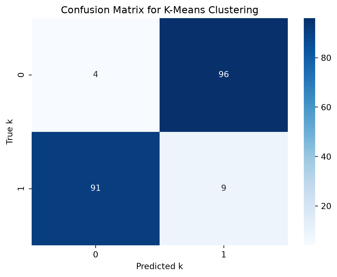
Question 2.2
Repeat the same thing as Q2.1, but change a different parameter to make it perform worse in a different way. Briefly explain why
# Modify this directly for your example
mu_1 = np.array([0.0, 0.0]) # mean of k=1
mu_2 = np.array([1.0, 1.0]) # mean of k=2
sigma = np.array([[0.2, 0], [0, 0.2]]) # use same variance
N = 100 # observations
X_1 = np.random.multivariate_normal(mu_1, sigma, N)
X_2 = np.random.multivariate_normal(mu_2, sigma, N)
df_1 = pd.DataFrame({"f1": X_1[:, 0], "f2": X_1[:, 1], "k": 1})
df_2 = pd.DataFrame({"f1": X_2[:, 0], "f2": X_2[:, 1], "k": 2})
df = pd.concat([df_1, df_2], ignore_index=True)
kmeans = KMeans(n_clusters=2, random_state=0)
df["k_hat"] = kmeans.fit_predict(df[["f1", "f2"]]) + 1
cm = confusion_matrix(df["k"], df["k_hat"])
sns.heatmap(cm, annot=True, cmap='Blues')
plt.xlabel('Predicted k')
plt.ylabel('True k')
plt.title('Confusion Matrix for K-Means Clustering')
plt.show()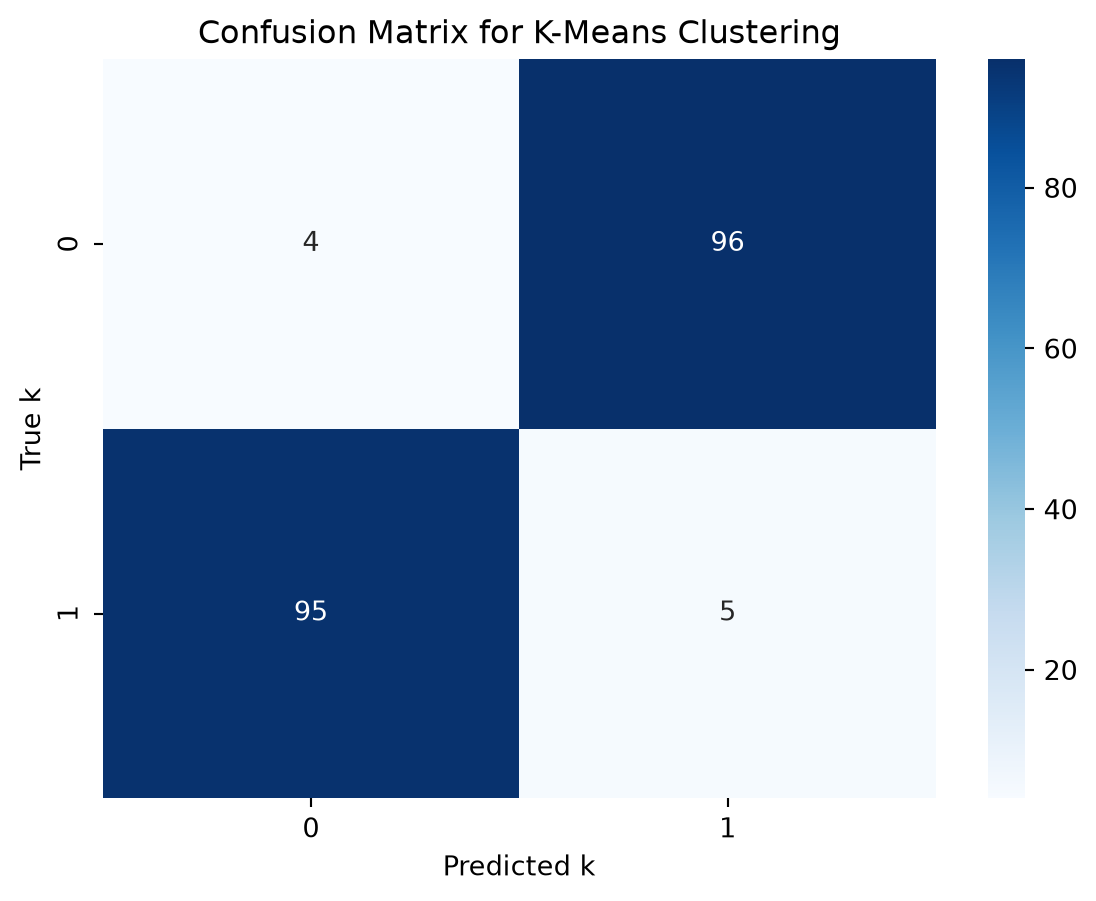
Question 3
Question 3.1
Take the following example of generated data and latents
def generate_noisy_circle(radius, num_points, noise_std):
    theta = np.linspace(0, 2*np.pi, num_points)
    x = radius * np.cos(theta) + np.random.normal(0, noise_std, num_points)
    y = radius * np.sin(theta) + np.random.normal(0, noise_std, num_points)
    return np.column_stack((x, y))

# Generate data for inner and outer circles
X_1 = generate_noisy_circle(0.5, 100, 0.05)
X_2 = generate_noisy_circle(1.5, 100, 0.05)

# Create dataframes
df_1 = pd.DataFrame({"f1": X_1[:, 0], "f2": X_1[:, 1], "k": 0})
df_2 = pd.DataFrame({"f1": X_2[:, 0], "f2": X_2[:, 1], "k": 1})
df = pd.concat([df_1, df_2], ignore_index=True)
fig, ax = plt.subplots(figsize=(6, 4))
sns.scatterplot(data=df, x="f1", y="f2", hue="k", ax=ax)
ax.set(xlabel="Feature 1", ylabel="Feature 2", title="Latent Groups")
plt.show()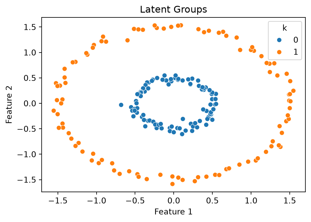
Note that the k=0 and k=1 state are fully separated and the difference is visually obvious. Now lets perform k-means clustering
kmeans = KMeans(n_clusters=2, random_state=0)
df["k_hat"] = kmeans.fit_predict(df[["f1", "f2"]])

# Create confusion matrix
cm = confusion_matrix(df["k"], df["k_hat"])

# Plot confusion matrix
sns.heatmap(cm, annot=True, cmap='Blues')
plt.xlabel('Predicted k')
plt.ylabel('True k')
plt.title('Confusion Matrix for K-Means Clustering')
plt.show()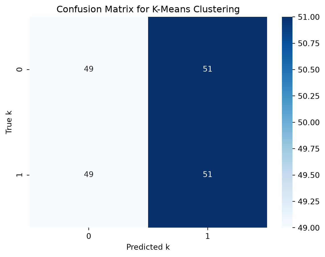
Can you explain why this was a failure using your knowledge of k-means clustering? Be precise if possible.
Answer:
(double click to add an explanation here)
But all is not lost! Look at the results of the following code which uses a different algorithm
from sklearn.cluster import SpectralClustering
spectral_clustering = SpectralClustering(n_clusters=2, affinity='nearest_neighbors', random_state=0)
df["k_hat"] = spectral_clustering.fit_predict(df[["f1", "f2"]])

# Create confusion matrix
cm = confusion_matrix(df["k"], df["k_hat"])
sns.heatmap(cm, annot=True, cmap='Blues')
plt.xlabel('Predicted k')
plt.ylabel('True k')
plt.title('Confusion Matrix for K-Means Clustering')
plt.show()
/home/runner/work/grad_econ_datascience/grad_econ_datascience/.venv/lib/python3.13/site-packages/sklearn/manifold/_spectral_embedding.py:325: UserWarning: Graph is not fully connected, spectral embedding may not work as expected.
warnings.warn(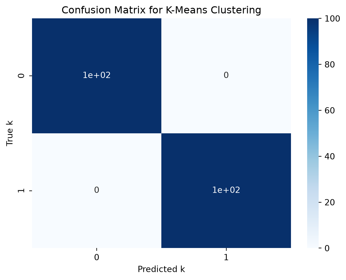
Lookup spectral clustering in skikit-learn docs, etc. and provide a 2 sentence summary of why this worked.
Answer:
(double click to add your explanation of why spectral clustering worked)
Question 4
Consider the following map
\[ x_{t+1} = f(x_t) = a x_t^2 + (1-a) \]
Where we will assume that \(a=\frac{3}{4}\). The code below comes from the lecture notes, and can be used to simulate this map
def simulate(f, X_0, T):
    X = np.zeros((1, T+1))
    X[:,0] = X_0
    for t in range(T):
        X[:,t+1] = f(X[:,t])
    return X
def f(x, a):
    return a * x**2 + (1-a)
T = 10
x_0 = 0.1
X = simulate(lambda x : f(x, 3/4), x_0, T) # use a=3/4
fig, ax = plt.subplots(figsize=(6, 4))
ax.plot(range(T+1), X.T)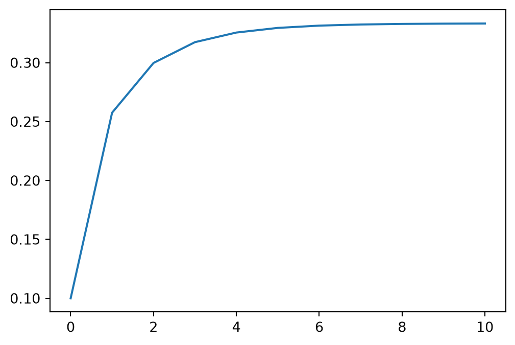
Question 4.1
If I solve the equation \(x^* = f(x^*)\) for \(x^*\) using the quadratic formula you get the following:
def x_star(a):
  return [(1 + np.sqrt(1 - 4 * a*(1-a)))/(2*a),(1 - np.sqrt(1 - 4 * a*(1-a)))/(2*a)]
print(f"x^* = {x_star(3/4)}")
x^* = [np.float64(1.0), np.float64(0.3333333333333333)]Adjust the above code to simulate up to \(T=5\) from \(x_0 = 0.9\) and \(x_0 = 1.1\) and plot the results.
# Modify this code
T = 5
X = simulate(lambda x : f(x, 3/4), x_0, T) # use a=3/4
fig, ax = plt.subplots(figsize=(6, 4))
ax.plot(range(T+1), X.T)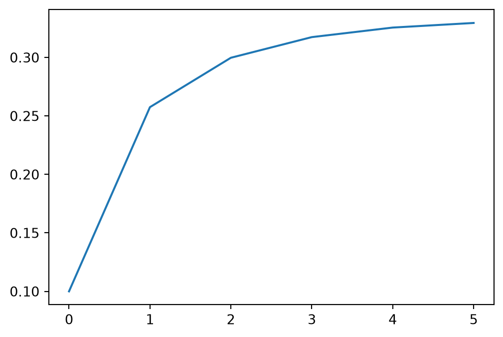
What do you notice about this and how do you interpret the different behavior for various \(x_0\)?
Answer:
(double click to add your explanation)
Question 4.3
See the graph below with \(x_0 = 1.0\) and a very large \(T\).
T = 500
X = simulate(lambda x : f(x, 3/4), 1.0, T)
fig, ax = plt.subplots(figsize=(6, 4))
ax.plot(range(T+1), X.T)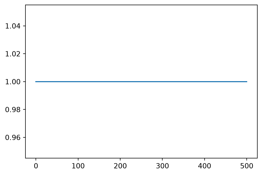
And \(x_0 = 1 + 10^{-15}\) and even a smaller \(T\)
T = 89
X = simulate(lambda x : f(x, 3/4), 1 + 1e-15, T)
fig, ax = plt.subplots(figsize=(6, 4))
ax.set_yscale('log')
ax.plot(range(T+1), X.T)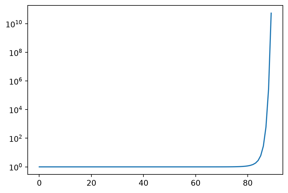
Notice the log scale on the axis. Briefly interpret these results
Answer:
(double click to add your interpretation)
Question 5
Find some economic or financial data on the web of your choice
- Download it and load it into a pandas dataframe
- Either run PCA or k-means clustering on the data
- Briefly interpret the results in whatever way you wish
We are not giving you a list of possible datasources because we want you to explore to look for interesting sources of data.
The economic rational for looking for the dimension reduction or the clustering doesn’t need to be especially tight, but do your best to explain why you ran the particular specification.
For the data, post a link to where you found it but: no need to have it automatically downloaded in the notebook, and no need to post it up with your problem set.
# Your code hereAnswer:
(double click to add a brief interpretation or summary)